Declarative GPUI, with zero runtime overhead
A ui! macro for building GPUI element trees with Tailwind-style
tokens and real Rust control flow. Every token compiles directly to GPUI
builder calls — colors resolve to final Hsla values at compile
time, faster than typical hand-written GPUI.




$ cargo add declarative-gpuifn render(items: &[Item], modal: Option<Modal>) -> impl IntoElement {
ui! {
col(gap_4 p_16 bg_1c1a17 rounded_lg shadow_md) {
row(items_center justify_between) {
text("Inbox" text_lg semibold text_f5f0e8)
{ ..badge } // Option → renders nothing on None
}
for item in items {
row(gap_2 px_8 py_2 on_hover = |_, _, _| {}) {
text(&item.title text_sm)
}
}
if let Some(m) = modal {
{ backdrop() }
{ m }
}
}
}
}The generated code is what a careful GPUI author would write — or better
Guarantees pinned by tests, not promises.
Compile-time colors
bg_1c1a17 emits a precomputed Hsla literal — no rgb() hex unpacking or RGB→HSL conversion per frame. Named colors and 3/4/6/8-digit hex with alpha.
Const theme palettes
color!(1c1a17) exposes the same conversion standalone: build const light/dark Hsla palettes, and a themed bg = th.panel is a plain field copy.
Real Rust control flow
if / if let / for / match (with guards) work anywhere a child can appear and expand to actual Rust — multi-node branch bodies included.
Spread children
{ ..expr } spreads any IntoIterator of elements into the parent: an Option, a Vec<AnyElement>, or a mapped iterator.
Conditional tokens
when(dark, bg_1c1a17, text_f5f0e8) expands style tokens inside a .when() closure — conditional and theme-dependent styling without giving up compile-time colors.
Stateful, automatically
on_click, active, tooltip, scroll tokens — anything needing Stateful<Div> gets a stable auto-ID injected. No ordering footguns.
No hidden costs
Unstyled text(...) emits bare content (no wrapper div). list moves its render closure — no Arc. Every element yields its concrete type — no boxing.
See for yourself
Unknown style tokens are compile errors, never silently ignored. And ui_expand! returns the generated builder code as a string — a per-invocation cargo expand.
Code → pixels
47 lines of ui! render this card — pixel-identical to the
165-line hand-written GPUI version. 72% less code.
ui! (47 lines)
ui! {
    col(gap_4 p_16 bg_1c1a17 rounded_lg) {
        row(items_center justify_between) {
            text("Team Inbox" text_lg semibold)
            text("3 new" text_xs text_8a857c)
        }
        for item in items {
            row(gap_2 px_8 py_2 rounded_md
                on_hover = hover_handler) {
                text(&item.title text_sm)
            }
        }
    }
}
Rendered result

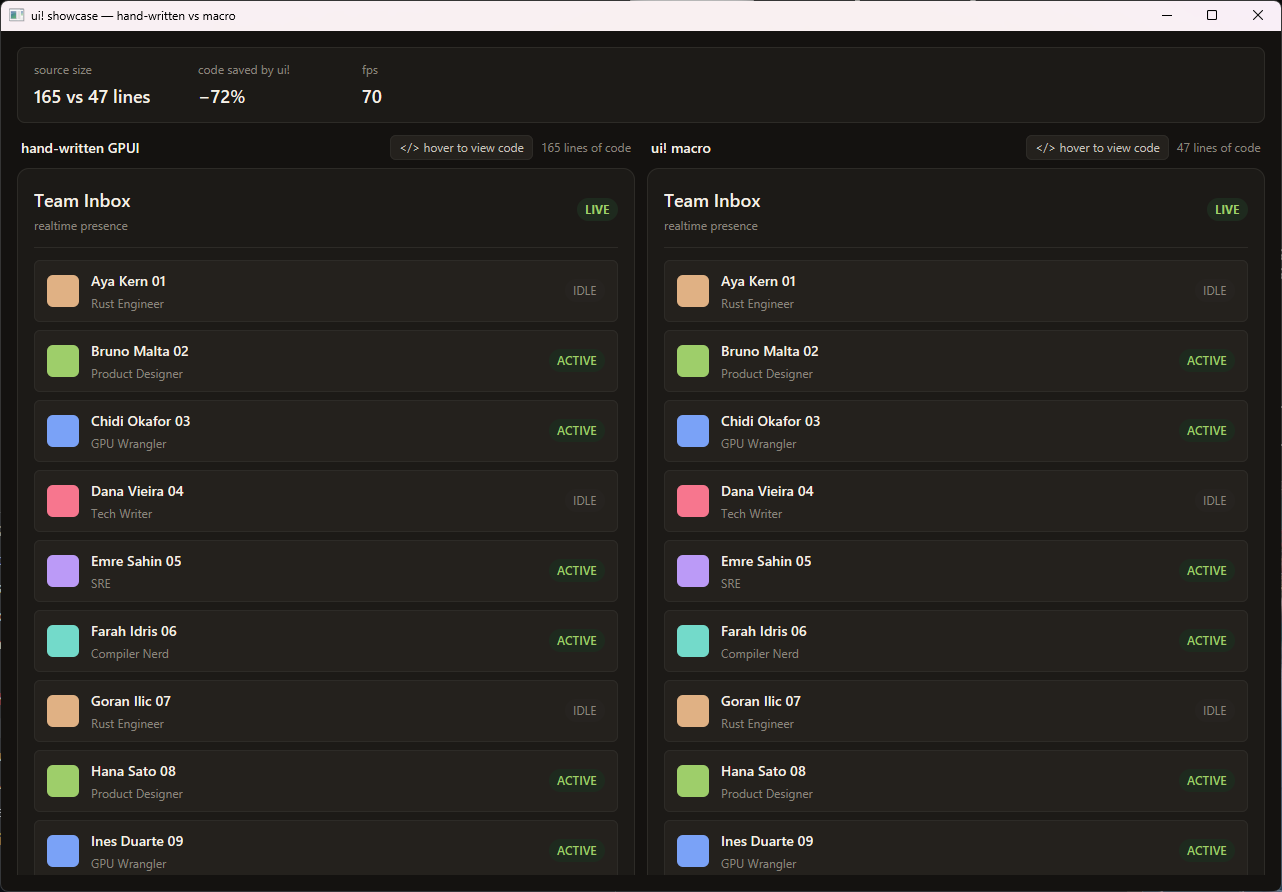
cargo run -p declarative-gpui-examples --release
Elements at a glance
Built-in containers expand to flex-configured divs; any other name —
or path like Button::new — is called as a constructor
with the leading positional args, so your own components and
libraries like gpui-component drop straight in.
Full style-token reference in the
README.
| Element | Expands to |
|---|---|
row(...) | gpui::div().flex().flex_row() |
col(...), card(...) | gpui::div().flex().flex_col() |
center(...) | flex row, items + justify centered |
scroll(...) | stateful div, stable auto ID + overflow_y_scroll() |
list(id, count, render) | gpui::uniform_list(...) — closure moved, no Arc |
text(content, ...) | bare content; styled wrapper only when styles present |
badge("hi", ...) (any name) | badge("hi") — your constructor, leading args pass through |
Button::new("ok", label("Go")) (any path) | Button::new("ok").label("Go") |